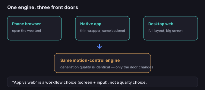
The question "should I use the app or the website?" sounds like it's about two different products. It usually isn't. The motion-transfer model runs on the same servers either way; what changes is the front door and the screen you're working on. Once you stop treating "app vs web" as a quality choice and start treating it as a workflow choice, the decision gets simple.
Why "app vs web" is mostly a delivery question
What people mean by "the app" is usually one of two things, and neither changes the output:
- The web tool opened in a phone browser. Same page, same controls, just smaller. This is the most common "mobile" path.
- A thin native wrapper. If a vendor ships a phone app in your region, it typically loads the same web service with a native shell — convenient launcher, but the generation still happens on the same backend.
So the honest comparison is not "app quality vs web quality." It is "what can I comfortably do on a phone screen versus a desktop screen, given the same engine." That's a question about input and editing, not about whether the motion looks better.
What actually differs
| Task | Phone (browser/app) | Desktop web |
|---|---|---|
| Shoot a reference video | Excellent — camera is right there, no transfer | Awkward — need to get the file onto the computer |
| Pick a character image | Fine for a quick pick from your gallery | Easier to browse folders and compare candidates |
| Fine-tune settings | Workable but cramped; easy to mis-tap | Comfortable; full layout visible at once |
| Review and trim motion | OK for a fast glance | Better for frame-by-frame checking |
| Batch several clips | Slow — small screen, one at a time feels heavy | Natural — queue and compare side by side |
| Edit the result (cut, remove bg) | Possible, but fiddly on a small display | Where the real post work belongs |
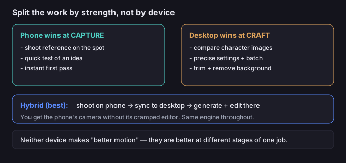
The pattern is clear: the phone wins at capture, the desktop wins at craft. Neither is "better" at motion — they are better at different stages of the same job.
When to use which
- Use the phone when you're somewhere with a subject worth filming, you want to test an idea immediately, or you just need a first pass to see if the motion reads.
- Use the desktop when you're comparing character images, adjusting settings precisely, generating several variations, or doing the post-edit (trimming, removing the background).
- Hybrid (best of both): shoot the reference on the phone, push it to the desktop session, do the generation and editing there. You get the phone's camera without its cramped editor.
5-step phone-first workflow
- Shoot the reference on the phone. You already have the camera; capture the motion where it happens instead of recreating it later on a computer.
- Run one quick test in the browser. Confirm the motion transfers before you invest in a desktop session — a 30-second check saves a trip to the computer for a bad idea.
- Open the same account on desktop. Your references and results should sync; pick up the good take where the screen is big.
- Do the craft work on desktop. Compare character images, tune settings, and generate the variations you actually need.
- Finish with the edit. Trim, then remove the background if you're compositing — that step is far calmer on a full screen.
5 failure modes (and the fixes)
| Failure | Why it happens | Fix |
|---|---|---|
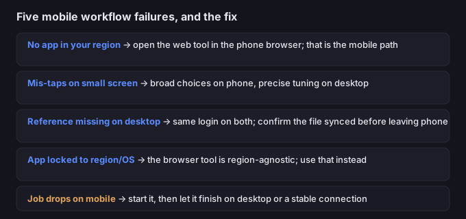
| Looking for an app that doesn't exist in your region | Assuming a native app is required | Open the web tool in the phone browser — that is the mobile path for most users |
| Mis-taps on a small screen | Cramped controls during fine settings | Set the broad choices on phone, do precise tuning on desktop |
| Reference shot on phone, can't find it on desktop | Different accounts or unsynced library | Use the same login on both; confirm the file landed before leaving the phone |
| App locked to a region or OS | Vendor ships natively only in some places | The web tool in the browser is region-agnostic — use that instead |
| Generation drops mid-way on mobile | Screen lock, call, or flaky connection | Start the job, then let it run on desktop or a stable connection |
What to do when the motion is right but you're on the wrong screen
You don't have to finish where you started. A clip generated on a phone is the same clip on a desktop — the file isn't "phone quality," it's just a result. So if you captured and tested on the phone and the motion works, move to the desktop to do the careful part: compare takes, adjust, and run the background removal. The tool on this site runs in your browser, so your video never leaves your device while you work — nothing is uploaded to a server, on either screen.
Common questions
Is there a dedicated mobile app I must install?
Not necessarily. For most users the mobile path is the web tool opened in the phone browser. If a vendor offers a native app in your region, verify it in your app store — but expect the same backend engine, not a different model.
Does the app produce better motion than the website?
No. The motion-transfer engine is the same behind both; only the screen and input method differ. Quality depends on your character image and reference video, not on which door you used.
Can I start on my phone and finish on my computer?
Yes — that's the recommended split. Capture and quick-test on the phone, then do precise editing and batching on the desktop using the same account.
Are my files uploaded when I edit them?
No. Anything you process with the tools on this page runs in your browser; we never receive your media.